To
ensure your email campaign has the best chance at success, use a
responsive design that looks good on any screen size. Instead of
designing your own, take advantage of these free responsive templates
that have already been tested on a variety of screen sizes and email
clients.
Here is a list of free responsive email templates. There are single
email templates, as well as template sets with multiple design options.
All of these templates can be modified to suit your needs. In addition,
several of the template sites also feature helpful email reference
guides to make the most of your campaign.
Ink is a responsive email framework made by ZURB,
a design company for web products, services, and websites. Ink’s CSS
framework helps you craft HTML emails that can be read on any device.
Ink provides a set of four templates: Basic, Hero, Sidebar, and Sidebar Hero.
Each template is a single HTML email built using Ink. Preview them and
inspect the code to see how they were implemented, or download them and
make some changes.
—
Email Blueprints, from MailChimp,
is a set of six HTML email templates to serve as a foundation and
starting point for the design of emails. They include template language
elements specifically for MailChimp users, but those elements can be
stripped out to send through any system. For clarification on the coding
practices shown in these emails, or for general HTML email knowledge,
visit MailChimp’s HTML Email Reference.
—
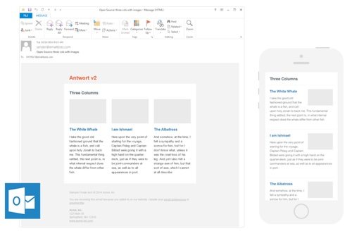
Antwort
offers responsive layouts for email, with columns on desktop that
automatically become rows on mobile. There are three available
templates: single column fluid layout, two column simple layout, and
three column with images. Antwort also provides an HTML Styleguide and a list of helpful resources.
—
This template
by Charles Memud is designed to work on all major email platforms and
smartphones. Using MailChimp’s Email Blueprint as the foundation, this
template is an improved version with more row options, redefined
structure, and platform fixes for Outlook, Yahoo, Hotmail, Gmail, and
more.
—
Here are seven free email templates available on Litmus, an email testing and analytics platform. The templates are from Stamplia,
an email templates marketplace. The templates come with the PSD —
Photoshop Document — source files to tweak and modify. In addition to
responsive templates, Stamplia offers a variety of templates for
newsletters, transactional emails, events, alerts, notices, and more.
—
Here is a free responsive email template from Email on Acid,
a preview service to see exactly how your emails will look in roughly
70 email clients and mobile devices. The template offers three different
layouts, which trigger based on the width of the screen. The default
layout supports up to three columns. The blog post lists the clients
that have been tested.
—
This is part of a series from Tuts+ called Mastering HTML Email.
In this tutorial, you learn to create a simple responsive HTML email
that will work in every email client. It uses minimal media queries and a
fluid width approach to ensure maximum compatibility. Once you’ve
finished, make sure you validate and test using live devices and a web
preview service like Litmus or Email on Acid.
—
Here is a free responsive email template
from Marco Lopes, a visual designer at boutique platform Farfetch.com.
The download file includes all PSD elements, as well as open-source HTML
and CSS. Download and customize as you see fit. The template was tested
on Litmus.
—
Online graphic design marketplace 99designs offered free responsive email templates to celebrate the launch of its Email Design
category. For the launch, it ran a contest asking designers to create
three templates for customers to download: a newsletter template, a
promotional template, and a template for email notifications. Each
template is available in green, blue, orange, and grey.
—
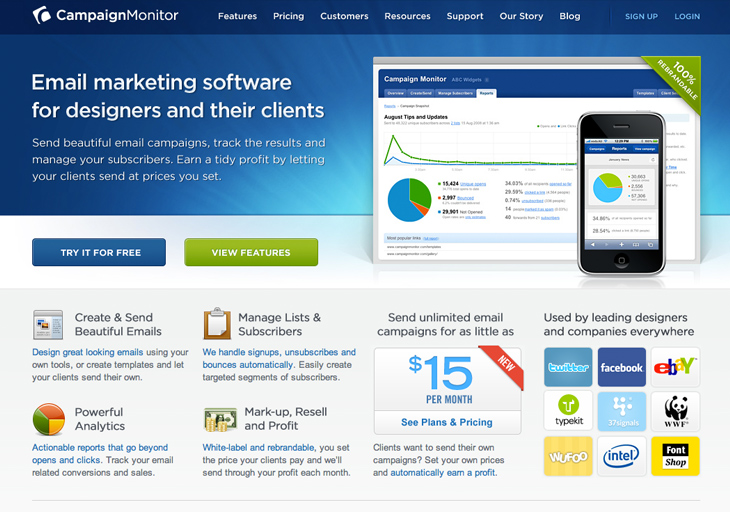
Template Builder is a tool from Campaign Monitor,
an email campaign platform. Using the drag-and-drop user interface, you
can easily create and preview a mobile-ready template. Drag pieces of
content like text, images, and buttons. Add different pre-design layout
areas, and customize. Once you’ve finished your template, use it in a
Campaign Monitor account or download the HTML, CSS, and images for free.
A good email template can make or break your
marketing, but designing and building a template from scratch can be a
very time-intensive process. Instead of creating a template from the ground up, let us save you hours
of precious time with these 10 places to grab your very own email
template. Simply download a template and customize it to fit your
specific needs. Oh and did we mention... They’re free!
The following sites offer free email templates or template builders
to get your next email campaign up and running in no time. Take a look
at what's out there for free and grab a new template to make your next
campaign capture more clicks than ever before!
1. Email on Acid's Responsive Design Template
Cost: Free! Not to pat our own backs too hard or
anything, but our template has gotten a lot of attention. It features a
few different types of content blocks that can be replicated or removed
with no problem. We built it with two breakpoints, one for tablets and
another for small devices like phones and iPods. It's fully tested to
render great on all clients. Grab it here totally free and see what you
can do with it!
Cost: Free! We can't write about free templates without mentioning ZURB's awesome tool. They offer five different templates, all of which are responsive and pretty w
ell made. The best part is, it's totally free. Go to their site for yourself, or check out one of the templates in your browser, below.
Cost: Free! Campaign Monitor provides excellent email services from start to finish, including a super cool template builder.
You can use it for free, no account required, and it does a bang up job
of making templates for your needs. Once you're done creating, you can
import it straight into your Campaign Monitor account or download it for
free and go from there. The folks at Campaign Monitor also run an excellent blog with lots of helpful tips, go check it out!
4. ActiveCampaign
Cost: Free (with account) ActiveCampaign
is a full service ESP that provides sending services, marketing
automation and email templates, along with their online email designer
tool. Check out some previews of the templates they offer here, or sign
up for a free account and log in to see for yourself. To find their
templates once logged in, click on the Campaigns tab, then on "Email
Templates" on the right side of the screen. Their library includes 52
templates that range from very simple (single column, white background)
to more complex.
5. 99 Designs
Cost: Free! 99 Designs
offers this free template pack on their blog, which includes 3
templates in 4 colors. These include a newsletter, a promotional email
and a notifications template. This trio would make a great starter
package for a business that's trying to establish a consistent look. If
you want something a little more custom, consider taking advantage of 99
Designs' crowd sourced design contests. You should have no problem
finding an amazing design at a good price.
6. Free Email Templates.com
Cost: Free! This site offers 70+ of email templates
for free, so it shouldn't be hard to find the right one for you. Use
the categories on the right side of the page to browse for the perfect
free template. All you have to do is download and customize their
readymade email templates for your business!
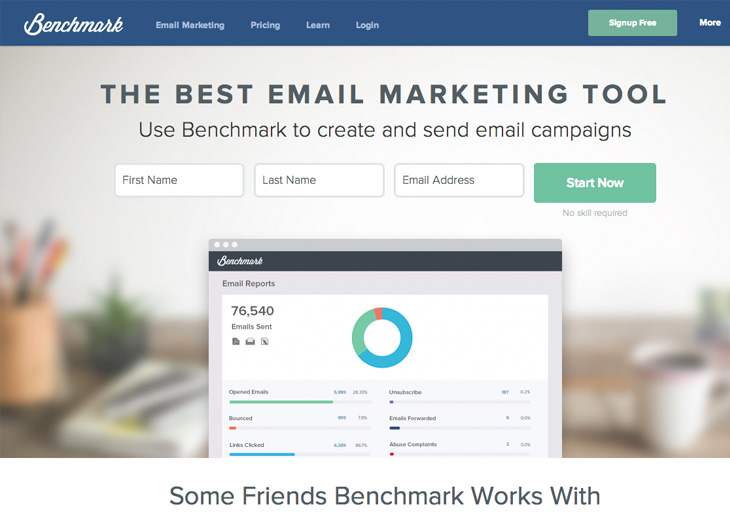
7. Benchmark Email
Cost: Free (as part of service) Benchmark Email
offers some free templates with its service, which you can try free for
30 days. Benchmark focuses on promoting events through email, and they
have a huge library of over 400 templates to support this. They
categorize their templates by industry, but it only takes a few copy and
image changes to convert a template for your specific niche.
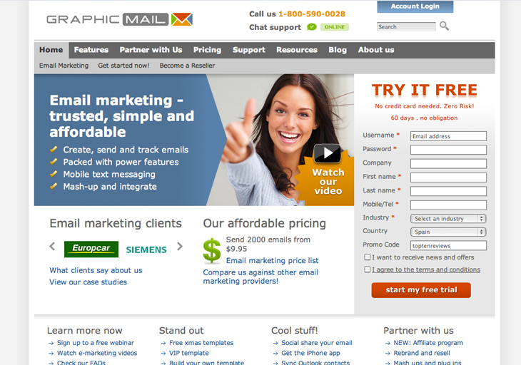
8. GraphicMail
Cost: Free (as part of service) GraphicMail
is an ESP that hosts a sizeable library of email templates. You'll have
to sign up for an account to get access to their templates, but don't
worry: it's free. For 15 days you'll have access to their support team
and all their cool features, but after that you'll have to pony up to
keep getting the good stuff. 15 days should be plenty of time to check
out their templates and see if they've got something to offer for you
and your business.
Want to customize these templates to better reflect your business?
Personalize these templates in a flash with fresh copy and images to
ensure your brand is resonating through the design. In no time you can
turn your next email campaign into a lean, mean prospect converting
machine!
What's your go-to place for free templates? Let us know in the comments below!
Jennifer Wong tackles tables, inline styles and inconsistent
CSS support to show you how to design modern, responsive emails.
It's the moment you've been dreading: the project of
redesigning all consumer-facing emails and making them responsive
becomes yours. And you've heard the rumours – designing emails means
coding like it's 1999, creating tables and adding styles inline (heaven
forbid), and throwing best practices and hopes of compatibility out of
the window. Unfortunately, the rumours are true.
For starters, tables are the only reliable way to create consistent
email layouts. Inline styles are a requirement because many email
clients do not support external style sheets, and Gmail doesn't support
the <style> element. Add to that inconsistent CSS
support across email clients, and it seems like responsive emails are
the makings of disaster.
Not to worry! In this tutorial, I'll help you get your emails in
shape for 2015 and ready for the responsive spotlight. I'll show you:
What's so important about design – and how a bit of research will save you a ton of time
Why you need a reusable, maintainable template (or three), and how to design one
When and how to use media queries and the ever-controversial !important
How to make desktop, mobile and web-based clients play nicely together (and which ones to watch out for)
Don't miss this!
So let's get started. When starting the design of an email, the
first, most important step is to establish your audience. Where do they
check their emails and what types of devices do they use? How much time
do they spend viewing each email? Are they more visual or analytical?
You need to determine the devices and clients on which your users
view emails. Targeting specific devices and email clients confines the
actual work of implementation, saving you time. For example, knowing the
majority of your users view their emails on mobile devices means you
can spend more time focusing on mobile email design and less on desktop.
Or if you know that only 0.5 per cent of customers use Outlook 2000,
you might decide not to support that email client at all.
Design elements
Knowing which devices most of your customers use helps you design for
a specific minimum touchable area (MTA). This can be thought of as the
size of a button for mobile devices.
You'll
often hear 44px by 44px thrown around in mobile design discussions
about MTA. Unfortunately, that number comes from the Human Interface
Guidelines for the first iPhone. In other words, it's severely out of
date. Accurate numbers should be based on the average size of a human's
thumb (about 0.4 inches, according to one study) and the pixels per inch (PPI) of the device.
A quick calculation will give you the minimum pixel dimension (MPD) for the size of your buttons:
0.4" x Device PPI = MPD
PugetWorks provides some helpful numbers here.
Content above the fold is another crucial aspect of responsive email
design to consider. Your most important information should be conveyed
in the initial viewport of any device. If your hero image is too tall
and has huge margins, your title text may be pushed below the fold on a
mobile device.
It's even possible that people won't think to scroll down, thereby
disregarding your email entirely. Keep this in mind when designing your
emails and be sure to use an email testing suite or a library of devices
so you can see what content is immediately viewable across devices and
email clients. Style Campaign’s impressive 34-piece device library, proving that its advice and posts are battle-tested and accurate
Once you have an initial design, it's a smart idea to iterate. A/B
tests determine what types of emails and designs are most effective for
your users. It's a common belief that more images mean more engagement,
but sometimes text-heavy emails result in better click-through rates.
The only way to know is by testing the heck out of your emails.
Using templates
Templates save time by following the DRY principle. They also allow
for abstraction of code and the reuse of styles and snippets over
several types of emails. You'll likely have one overarching (or main)
template that contains base styles for all of your emails, snippet
templates for pieces of code that appear in most of your emails, and
several unique templates that each represent one email.
Think of your main template as a sort of container for your emails. Use max-width of 550-600px, a number based on the typical preview pane of email clients. With max-width, content will stay enclosed within those bounds, ensuring that users won't have to scroll or scan from side to side. Note that max-width is not supported by Outlook 2007, 2010, or 2013.
Next, consider what design elements you're likely to reuse in most
emails. For example, you'll probably have the same header, footer, and
social media calls to action in many of your emails. These will be your
snippet templates. For snippets, use a templating system to break those
portions of code out into their own separate files. Then every email
that uses those snippets can include an abstracted file in its unique
template, saving you from typing the same code over and over again.
At a previous job, we used Handlebars.js and had a snippet (or what
Handlebars calls a 'partial') for a badge that was repeated in our email
widgets. So I had a snippet file called _badge.hbs and included it using the syntax for partials: {{> _badge}}.
Tackling tables
Mozilla Developer Network states, “Prior to the creation of CSS, HTML <table> elements were often used as a method for page layout. This usage has been discouraged since HTML 4, and the <table> element should not be used for layout purposes”. But when it comes to email, we know better: tables are necessary for layout.
Without an outer <table>, the entire email will disappear from Apple Mail and Outlook 2011. But even if we do use an initial outer <table>, that's just the beginning. The more complicated the layout, the more <table>s you'll need.
Since emails contain a multitude of nested tables, comments often
save the day. Add comments stating the purpose of a table at the
beginning and end of the table's HTML to help you and your colleagues
quickly read your email code.
When designing my first template, I discovered that you need to set <table> to display: block; or email clients on Chrome will ignore your max-width. This is something to keep in mind if you notice problems with your table widths.
Inline styles
As mentioned above, because of inconsistent <style>, <link>, and <head>
support, inline styles are necessary to style your email. You can save
time by finding a CSS inliner tool that will translate styles from a <style> or external style sheet, so you don't have to write CSS in multiple places.
There are many inliner tools to choose from on the web. Well-known
companies like Campaign Monitor, MailChimp and Zurb, as well as generous
individuals in open source, provide CSS inliners for free. Most just
require you to paste HTML with a <style> onto their site. For a more permanent solution, some tools can be incorporated directly into your project as a plugin.
Alternatively, always writing your styles inline typically allows for
quicker prototyping, which will also save you time. When your styles
are inline throughout your coding process, it's easy to change them
right in the HTML and immediately see how the email rendering is
affected.
When debugging email code, keep in mind inline styles are highest in CSS hierarchy, with the exception of styles that use !important. So when you're trying to find the origin point of styles, you'll have to check your external style sheet, <style> in HTML, and inline styles, then do a quick search for !important in each of those locations.
Going responsive
Responsive web design depends heavily on media queries. These target
different media types, widths, device pixel ratios (for high-resolution)
and more. While not completely useful with email, media queries are
supported on iOS 7, iPad, AppleMail, and webmail clients.
There are several breakpoint widths associated with specific devices,
which you can use to your advantage if you want specific content to be
shown or hidden at different times (CSS Tricks has a great article on this). Again, don't forget to take note of which email clients do or do not support media queries.
When designing responsively, good practice means pairing media
queries with fluid layouts. Fluid layouts use percentage-based widths so
content flows to fit smaller screens. Often in email design, you'll see
a max-width in px dimensions paired with a width of 100%. This strategy confines desktop email clients to a max-width of 550-600px, but allows the email to fill the screens of mobile devices that are under 550-600px.
As mentioned previously, Outlook 2007, 2010 and 2013 ignore max-width and min-width.
You'll therefore need a bypass in order for emails to display
correctly. This bypass employs fluid layouts for most clients and a
fixed (instead of max) width within a media query for widescreen desktop
clients. This is another great example of pairing fluid and responsive
layouts.
.background-table {
width:100%!important;
}
@media only screen and (min-device-width: 768px) and (max-device-width: 1024px){
.background-table {
width: 600px;
}
}
Often developers say that !important should never be
used. However, inline styles overwrite styles contained in media
queries. In this case, the only way for the styles in a media query to
take precedence over inline styles is by using !important.
@media only screen and (max-width: 480px),(max-device-width: 480px){
Note that if you decide to use !important on inline styles, Outlook 2007 will completely ignore styles assigned that way.
Email quirks
Email clients do a lot of weird things. Some of these you can prepare
for. For example, many clients automatically hide images and require
users to enable the display of them. To combat this, it's a great idea
to include an alt attribute and/or background-color style for each of your images. That way, at least some content is temporarily displayed for the users in place of your images.
Other times, email client quirks are completely unpredictable. For
instance, white space in your email code can sometimes affect rendering.
I once noticed that images that were displayed in Gmail included a thin
grey border. I could not for the life of me determine the cause.
Eventually, I discovered that removing the white space between the <img> and surrounding <a> made that grey border disappear.
In the middle of my email design, I noticed that Gmail was causing another problem with my <a> elements – it wasn't rendering my links with the custom colour I'd implemented. I remembered that Gmail does not support <style> or <link> in the <head>. Since I had decided to overwrite the default link colour, that meant I had to add a color style to each and every <a> within my email code.
Testing, testing, testing
Where A/B testing your emails is important for determining content
and evaluating user interaction, comprehensive testing of email
rendering is necessary for ensuring users can even view your emails.
Email testing suites show how your emails render across several clients
at a glance. All you do is send an email to their system, and they
display all the results on one page. They also often cover spam and
plain text testing.
Testing suites go a long way in helping you check your email
rendering, but not quite far enough. While they typically include at
least one version of most email clients, they often miss popular mobile
and desktop operating systems, which can heavily affect rendering, even
within the same email client. They also take a long time to update with
the newest clients. The results of a test displayed in Litmus, a comprehensive email testing suite
I highly recommend testing on live devices completely or at least to
supplement any email testing suite. You can quickly build up a device
library and update faster than an email testing suite might. If you
purchase all of your own devices, there's an added benefit of being
able to test web pages across mobile browsers, operating systems and
devices.
Personally, I own and use a Samsung Galaxy S3 running Android Jelly
Bean (v4.3). To my knowledge, no email testing suite includes this
version of Android, so I'm often sending myself emails. I test Android
Email, Gmail and Inbox on my personal device.
Even Android KitKat (v4.4), which has a market share of 41.4 per cent
(as of April 2015, according to Android Developer Dashboard), goes
untested in popular email testing suites. These are just a few examples
of what you might be missing by only testing with an external source.
Onward into the future
Everything I've talked about in this article will help get you
started on your responsive email design journey. My advice here will
provide a great foundation upon which to build more complicated emails.
But this is just the tip of the email iceberg. To keep up to date on all
the latest trends, be sure to do plenty of your own testing, pay
attention to the release of new email client versions, and check out the
resources I provided.
In the spirit of working smarter, not harder, here are eight tools that can maximize your email marketing efficiency.
1. Scope - Go behind-the-scenes of an inspiring email
Have you ever wondered how that beautiful email in your inbox got so beautiful?Scope creates a web-based version of any email you choose and reveals its HTML source code, mobile rendering, and desktop and plain-text views.
The free tool, created by the email marketers at Litmus,
comes as a bookmarklet and works inside supported email clients like
Gmail. Open an email, click the Scope button in your bookmark bar, and start inspecting.
2. Premailer - Convert HTML design to email-ready inline CSS
The retro nature of email design—heavy on tables, blind to external
CSS—makes life interesting for designers. Styles must be declared inside
each element, which can be a tedious-if-not-interminable task. To save
time and sanity, you can convert a well-designed HTML file to inline CSS using a tool like Premailer.
The free service lets you link to an online HTML file or copy and
paste HTML code. What sets Premailer apart is that you can further
customize your new file by appending tracking codes onto links and
checking through a list of helpful options like removing unused tags and
comments. Premailer even tells you HTML and CSS warnings you might want
to watch for the next time you design. 3. Beaker - Convert HTML email to plain text
To quickly convert your HTML email masterpiece into plain text, you can use a service like Beaker, which does the transitioning for you. A product of the Mailchimp Labs
team, Beaker reads through your HTML email, grabs the text and
hyperlinks, and spits out a simple, text-only version. It's no site to
see, but it's functional. That's why people choose to receive plain-text
emails, right?
Be proactive against improper spam labeling by first running your email through a spam check like the free Email Spam Test.
Input your subject line and HTML source code, and Email Spam Test will
run your email against various tests like Bayesian spam filtering, link
trackers, and more. You get a spam score and a full report at the
finish.
5. Mailchimp - Get suggestions for your subject line
When composing the perfect subject line, it never hurts to have a little help. Mailchimp has one of the best resources for quality subject lines
built right into its campaign software. When composing a new email,
enter your proposed subject line and click on the link to 'research
subject lines'. A pop-up will appear and tell you if you're on the right
track and even make suggestions for alternatives.
If you are interested in a one-off subject line service, you can try SubjectLine.com.
The site gives you marketing tips and a score based on the subject line
you submit. You get one freebie before the site asks you to sign up.
6. Litmus - See how your email looks in different email clients
All email clients—Gmail, Outlook, Yahoo, etc.—choose to display
emails differently, so it helps to know how your recipients might be
receiving your message. Email services like Mailchimp and Constant
Contact offer inbox inspection for free when you create an account.
Litmus does them one better by showing you how your email looks in 34 different inboxes,
and you don't have to sign up to see the results. Enter your HTML code
and your email address, and Litmus will run the tests and email you when
the results are ready.
7. Pictaculous - Match your email colour scheme to your main image
If you are trying to achieve symmetry with your main image and your colour scheme, Pictaculous can tell you which colors to use
based on the image you upload. The free tool even goes so far as to
suggest color palettes from Kuler and ColourLovers, along with the
default hex color suggestions.
8. Chimp Feedr - Combine RSS feeds to create the perfect RSS-to-email campaign
If you have ever 'clicked here to subscribe to updates,' you have
likely been a part of an RSS-to-email campaign. And if you've ever
thought of creating your own campaign across multiple feeds or sites, Chimp Feedr
is the tool to get that job done. Combine 10 or more RSS feeds to
create one gigantic feed that you can then feed into your email service
for your new campaign.
Email marketing is a form of direct marketing which uses electronic
mail as a means of communicating commercial or fund-raising messages to
an audience.
Although there are multiple options available for those looking to
start their own newsletter or email marketing campaigns, Awwwards
presents top 10 Email Marketing Services for do it the best way.
We hope you like it.
To stick with the “10” theme for VR’s 10th Birthday this month, here
are 10 things you can test in your email to make it better than ever.
From Name: The most effective From Name is what your recipients recognize you by or expect to hear from. Not sure what that is? TEST IT!
Subject Line: Send 10% of your email list one subject line, and another 10% a different subject line. Then, look at which subject line performs better and send the remaining 80% the more successful subject line. Easy as pie!
Pre-Header: Your pre-header should support or
complement your subject line. For example, your subject line tells your
recipients you’re having a sale (Get 50% Off for a Limited Time Only)
and your pre-header explains to the recipient what items are on sale
(Save on Designer Jeans & Jackets).
Headline: Your headline should clearly explain what your email is about and what’s in it for the recipient.
How You State Your Offer: Are you promoting a half
off sale? 50% off? Buy One Get One FREE? The way you say it can affect
the success – so make sure to test it before you go full throttle!
Button vs. Text Link: At VR we have found people like to click on buttons more than text links in our emails and newsletters. Click here to easily create and add buttons to your emails and see if it’s the same for you.
Color of Your Button/CTA: If you get the VRBuzz,
you may have noticed a change in the button color. That’s because we
tested blue buttons vs. green buttons and green was the lucky winner!
Test your button color and see what color your recipient’s eye is more
drawn to.
Placement of Call to Action: Test where you put
your Call to Action in your email and/or how many you include. Your
click-through rate will help you determine what worked and what didn’t.
Images: Test how many images you have, where you put them and what images you use. Remember to always use alt-text too!
Testimonials: Test to see if customer testimonials
help your emails perform better. If not, use the space for something
that’s more effective!
You hear so many rumors about what you can or can’t include in your
email if you don’t want it to land in spam. But a lot of those are
exactly that, rumors.
Using an ESP, like VerticalResponse,
is an excellent start to ensuring inbox placement, but spam filters
look for various things in emails to determine where they end up. Are
there too many links in your email? Did you use the word “Free” one too
many times? To help dispel the myths, we put some email testing and
delivery tools to the test using the same HTML code and subject line
from one of our recent newsletters. Here’s what we discovered:
Puts Mail is a basic testing application, but you can get some good
information about your HTML using this tool. First, they send you a test
of your email, so you can see it in your inbox. If you’re using an ESP,
you probably have this feature already, but if you don’t, it allows you
to see your how your email will appear in the inbox of your choice.
Then the tool goes through your code and detects if there’s anything
that could cause an issue and what that might be. Our newsletter checked
out okay, though anyone using Lotus Notes or Eudora may have some
issues with the CSS that was included. CSS is something that can be
tricky in different email programs; if you’re using CSS, be sure to keep
it inline to ensure it will work across a variety email programs. For
more tips on HTML for emails, check out our HTML Tips for Designing Your Email guide.
We’re fans of this tool because of the various email program display
views. It’s always important to know how things will appear for all of
your readers and the different programs they use. Email on Acid offers a
free version that shows what your email looks like in Gmail and Outlook
2003, plus they take a look at your HTML and let you know if there are
any issues. The paid versions offer more inbox examples, more analysis,
and check for spam filter triggers. Our newsletter looked great with the
free trial test on these two programs, but as we learned from the
previous tool, there could be some rendering issues on older email
programs.
Email Reach takes a different approach to testing emails by providing
a seed list of addresses to test. The nice thing about this service is
that they can test email programs around the world and on mobile. You
just need to download the list they provide, upload to your ESP and then
send test emails to that seed list. They’ll give you reporting on how
your email works in all the different accounts that they monitor. They
offer a 24-hour free trial and then a paid version once that expires.
They also check for spam folder placement and will analyze content and
HTML for possible spam problems.
If you’re worried about specific content that could cause your email
to land in the spam folder, this is the free tool for you. Lyris checks
the HTML and the content of your email and gives you score based on
where the email will end up. Zero is the best, anything over 3.0 and
they recommend changing your content to help ensure your email doesn’t
get marked as spam. They’re checking through SpamAssassin, a very
popular spam filter, for anything that is usually associated with spam.
Their website gives you a quick analysis and then they send an email
with more info and links to help you understand email delivery and how
you can improve yours. Our newsletter got a zero; we like to practice
what we preach!
Much like Email on Acid, Litmus offers a limited free test and a paid
version with more bells and whistles. The free test covers pretty much
any email program your readers could be using, plus mobile ones. While
the other tests are done in seconds, this one takes awhile, but for free
we were willing to wait a bit. There is also a subject line checker, to
see how your From label and subject line will look in different email
programs, landing page links and again, HTML analysis. There is one test
per email address, but the paid version allows unlimited testing for
all the features mentioned. As with the test on Puts Mail, our CSS was
trouble but otherwise the email looked good.
Email Spam Test is another free tool that provides you information
about whether your email may go to a spam folder. They don’t provide
much detail, but if there was a potential issue with your code or
content they let you know. Our newsletter did fine, although they
weren’t sure about the subject line. When we actually sent this
newsletter, the subject line performed on target and our opens/clicks
stats were right on the mark.
This is also a free spam test, but it requires a bit more info than
you may have. Not only do you need to paste in the HTML from your email,
but you also need to include the full headers as well. It makes for a
much more thorough test but also more time consuming. Just like Lyris,
they’ll give you your SpamAssassin score and let you know how close to
spam your email is.
There are many applications out there to test your email; these are
just a few to get you started. Continue to test different things with
your email and content especially if you find any problems getting
delivered to the inbox.
We also have free guides to help you, and for more anti-spam specifics, check out our webinar, How to Avoid the Spam Folder.
Have you checked out any recent email testing apps yet? Let us know in the comments.

