

12 Examples of Effective Email Marketing
1) Warby Parker
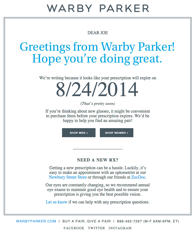
What goes better with a new prescription than a new pair of glasses? The folks at Warby Parker made that connection very clear in their email to my boss. The subject line was: "Uh-oh, your prescription is expiring." What a clever email trigger. And you've gotta love 'em for reminding you your prescription needs updating.Speaking of which, check out the clever co-marketing at the bottom of the email: If you don't know where to go to renew your subscription, the information for an optometrist is right in the email. Now there's no excuse not to shop for new glasses!
2) charity: water
When people talk about email marketing, lots of them forget to mention transactional emails.
These are the automated emails you get in your inbox after taking a
certain action on a website. This could be anything from filling out a
form to purchasing a product to updating you on the progress of your
order. Often, these are plain text emails that email marketers set and
forget.
Well, charity: water took an alternate route. Once someone donates to
a charity: water projects, their money takes a long journey. Most
charities don't tell you about that journey at all -- charity: water
uses automated emails to show donors how their money is making an impact
over time. With the project timeline and accompanying table, you don't
even really need to read the email -- you know immediately where you are
in the whole process so you can move on to other things in your inbox.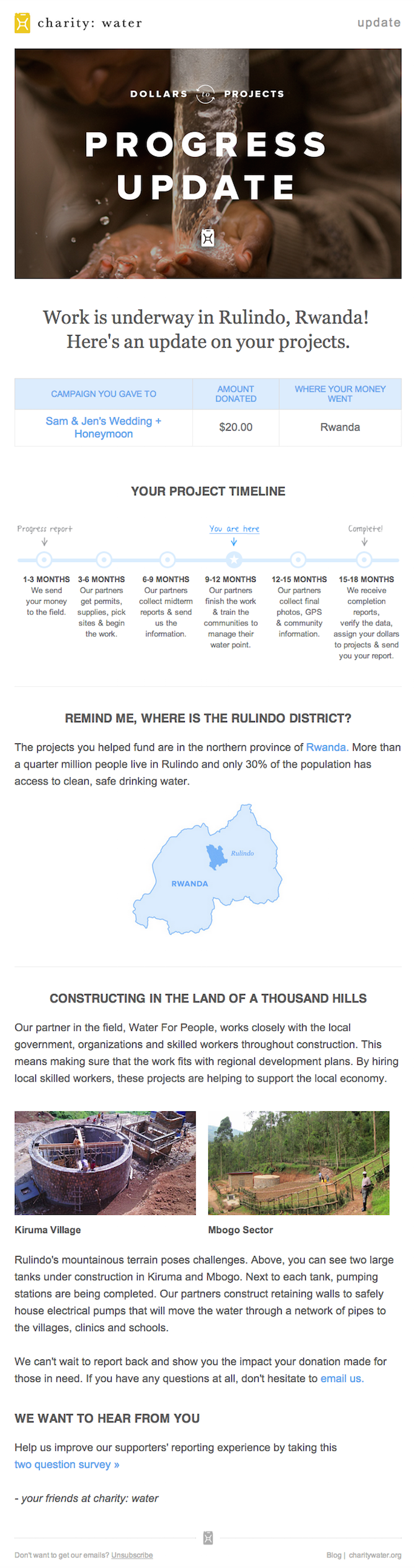
3) BuzzFeed
I already have a soft, soft spot for BuzzFeed content (70 pictures of dogs in their Halloween costumes, anyone?), but that isn't the only reason I fell in love with its emails.First of all, BuzzFeed has awesomely written subject lines and preview text. They are always short and punchy -- which fits in perfectly with the rest of BuzzFeed's content. I especially love how the preview text will accompany the subject line.
For example, if the subject line is a question, the preview text is the answer. Or if the subject line is a command (like the one below), the preview text seems like the next logical thought right after it:

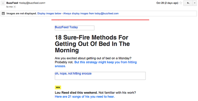
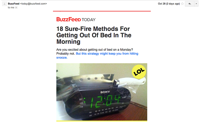
Once you open up the email, the copy continues to be great. Just take a look at that glorious alt text action happening where the BuzzFeed logo and first image should be. The email still conveys what it is supposed to convey -- and looks great -- whether you use an image or not. That's definitely something to admire.
Without images:
With images:
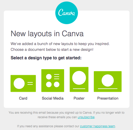
4) Canva
The beauty of Canva's
emails is in their simplicity. When they come out with a new design
concept, they let their email subscribers know by sending an email like
the one you see below. Each one gives a brief description, shows a
preview, and then encourages the reader to try it themselves. My
colleague Niti (who's
an email marketer herself) is a huge fan of their emails -- in fact,
she says Canva's emails have some of the best tie-ins to a product that
she's seen in any email campaign.
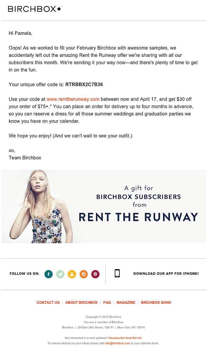
5) Birchbox
The subject line of this email from beauty product subscription service Birchbox got my colleague Pam clicking.
It read: "We Forgot Something in Your February Box!" Of course, if you
read the email copy below, they didn't actually forget to put that
discount code in her box -- but it was certainly a clever way to get her
attention. And the discount code for Rent the Runway, a dress rental
company that likely fits the interest profile of most Birchbox
customers, certainly didn't disappoint.
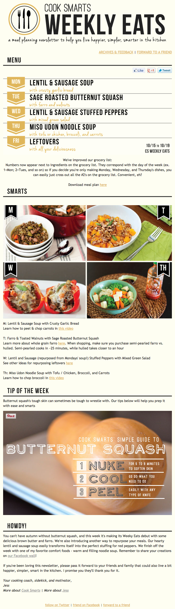
6) Cook Smarts
I've been a huge fan of Cook Smarts' "Weekly Eats" newsletter for a while. The company sends yummy yummy recipes in meal plan form to my inbox every week. But I didn't just include it because of its delicious recipes ... I'm truly a fan of its emails. I love the layout: Each email features three distinct sections (one for the menu, one for kitchen how-to's, and one for the tips). This means you don't have to go hunting to find the most interesting part of its blog posts -- you know exactly where to look after an email or two.I also love Cook Smarts' "Forward to a Friend" call-to-action in the top-right of the email. Emails are super shareable on -- you guessed it -- email, so you should also think about reminding your subscribers to forward your emails to friends, coworkers, or heck, even family!
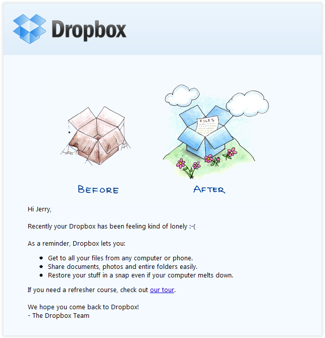
7) Dropbox
You might think it'd be hard to love an
email from a company whose product you haven't been using. But Dropbox
found a way to make their "come back to us!" email cute and funny,
thanks to a pair of whimsical cartoons and an emoticon. Plus, they kept
the email short and sweet to emphasize the message that they don't want
to intrude, they just want to remind the recipient that they exist and
why they could be helpful. When sending these types of email, you might
include an incentive for recipients to come back to using your service,
like a limited-time coupon.
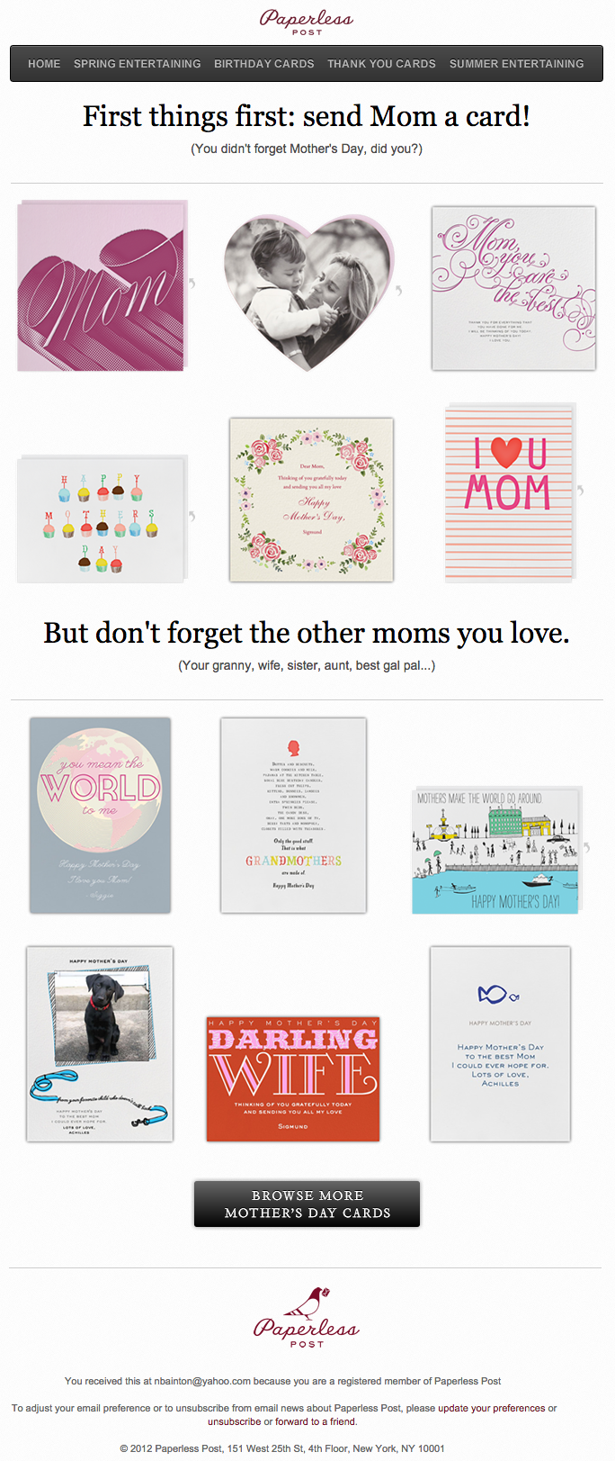
8) Paperless Post
When you think of "holiday email marketing," your mind might jump straight to Christmas, but there are other holidays sprinkled throughout the rest of the year that you can create campaigns around.
Take the email below from Paperless Post,
for example. I love the header of this email. First, it provides a
clear call-to-action that includes a sense of urgency. Then, the
subheader asks a question that forces recipients to think to themselves,
"Wait, when is Mother's Day again? Did I buy Mom a card?"
Below this copy, the simple grid design is both easy to scan and is
quite visually appealing. Each card picture is a CTA in and of itself --
click on any one of them and you will be taken to a purchase page.
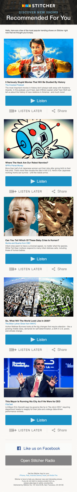
9) Stitcher
Humans crave personalized experiences. It's science. When emails appear to be created especially for you, you feel special -- you’re
not just getting what everyone else is getting. You might even feel
like the company sending you the email knows you in some way, and that
they care about your preferences and making you happy.
That's why I love on-demand podcast/radio show app Stitcher's
"Recommended For You" email. I tend to listen to episodes from the same
podcast instead of branching out to new ones. But Stitcher wants me to
discover (and subscribe to) all the other awesome content they have -- and I probably wouldn't without their encouragement.
I think this email is also quite a brilliant use of responsive design. The
colors are bright, and it's not too hard to scroll and click -- notice
the CTAs are large enough for me to hit with my thumbs. Also, the mobile
email actually has features that make sense for recipients who are on
their mobile device. Check out the CTA at the bottom of the email, for
example: The "Open Stitcher Radio" button prompts the app to open on
your phone.
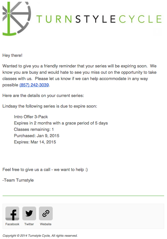
10) Turnstyle Cycle
When I got this email from spin studio TurnStyle Cycle, I felt like I was reading an email from a good friend.Design-wise, they kept it simple: a branded header followed by plain text and a simple footer. But the copy was what caught my eye. It's friendly, yet sincere: "We know you are busy and would hate to see you miss out;" "Please let us know if we can help accommodate in any way possible;" "Feel free to give us a call - we want to help :)". Plus, they provided me with the exact details I needed to know -- a reminder of what I'd signed up for and when, the expiration date, and a phone number to reach them.
The only thing missing here was a CTA button directed at the class schedule; but otherwise, the genuineness of the email copy really stuck out to me and made me feel close to the brand.
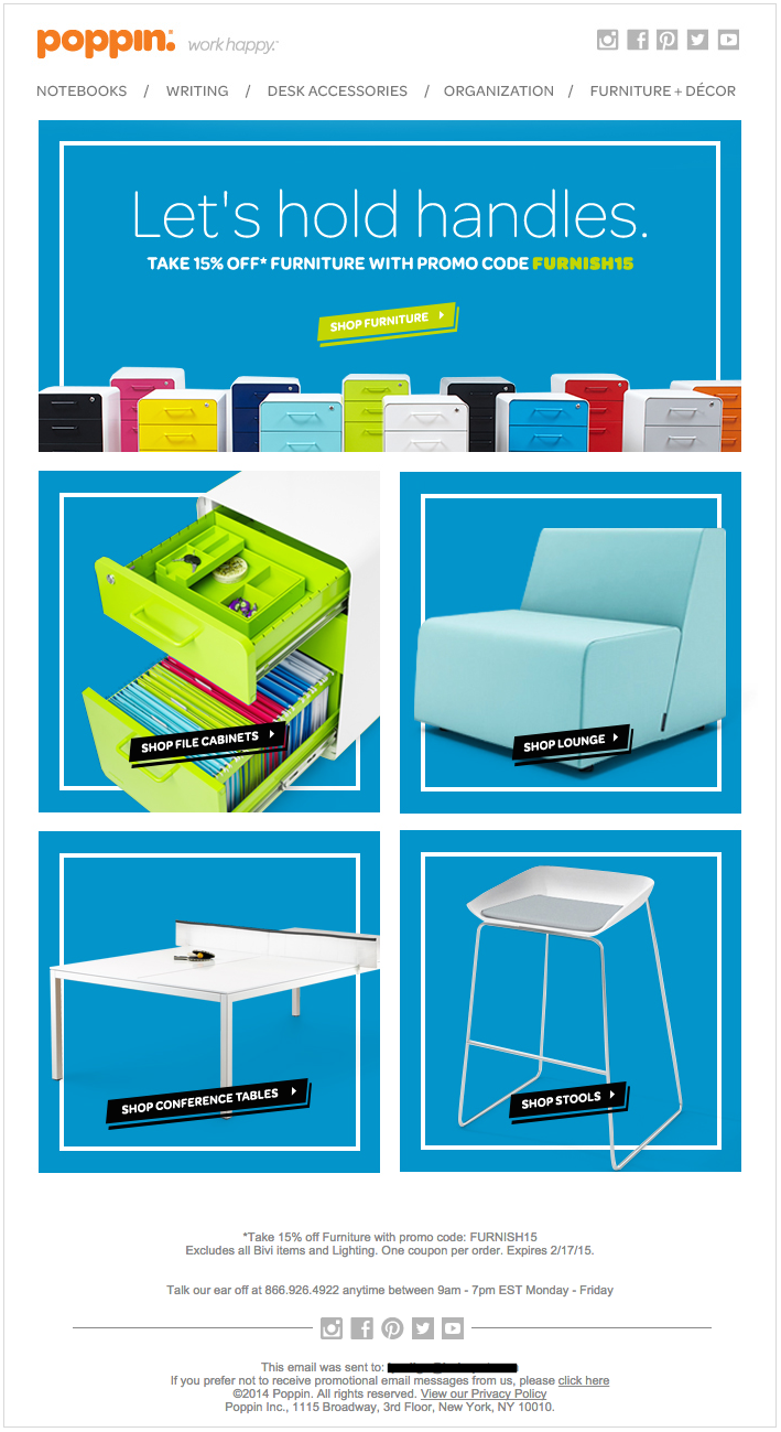
11) Poppin
Your customers want to hear from you about exclusive deals and other ways they can save money. Offering coupons and discounts via email can be an effective tool for both customer acquisition and customer loyalty. I think office
supply vendor Poppin did a great job with this email where they offer a
15% off promotion. The bright, bold colors and soft fonts match their
cool, modern branding, and the design is simple with four distinct
calls-to-action. Plus, I don't know about you, but I always love a good
pun.
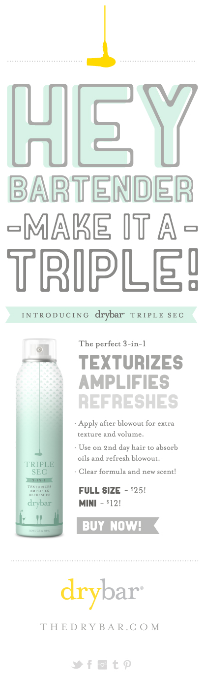
12) Drybar
Sometimes, the best emails have the
simplest designs. Design-wise, this email takes the cake. It's super
easy to scan, making it easy for you to digest what it's about. The copy
is simple but clever and aligns perfectly with their brand. And they
are telling you exactly what you need to know about the new product;
nothing more, nothing less. Because this email is about driving
awareness of a new product rather than converting someone to become a
lead or customer, that's all you really should be noticing. So hats off
to Drybar for using design to better communicate its message!
Editor's note: This post was originally published in October 2013 and has since been updated for accuracy and comprehensiveness.


Fabulous marketing standards! Got to know about Adwords Campaign Management from similar online shares and posts. Their subjective matters were amazing and also the techniques used will be perfectly suitable for flourishing trade. My cousin is also having good amount knowledge about convenient campaigning platforms.
ReplyDelete